August Equity
- Digital
- Branding
- Private equity
- Investor communications
With a refreshed leadership team, new office and renewed strategic direction, August Equity saw an opportunity to redefine its brand. As one of the UK’s leading lower mid-market private equity investors, August wanted a brand and digital presence that would reflect its evolving proposition, demonstrate momentum, and reinforce its distinct position in the market.
That is where Friend came in. We began with a series of stakeholder interviews and internal workshops – speaking to senior leadership, investors and portfolio management teams – to understand both how August was perceived and where it aspired to go. This was supported by a detailed peer audit and our own deep knowledge of the private equity landscape.


The insights shaped a new strategic brand framework – including purpose, mission and vision – designed to support the business’s long-term growth ambitions. We also partnered with the HR team to define values and behaviours that would guide culture and employee engagement.
“The new brand and website mark an important step in August Equity’s evolution, and Friend delivered exactly what we needed. The messaging and visual identity perfectly capture the direction we’re taking the business in and tie in seamlessly with our move to a new office – a moment of real change and momentum for us."
David Lonsdale, Managing Partner
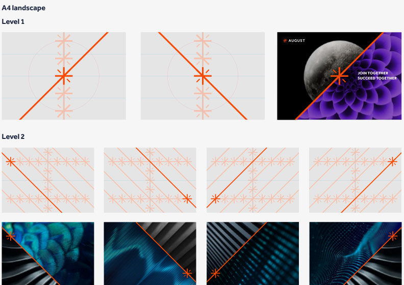
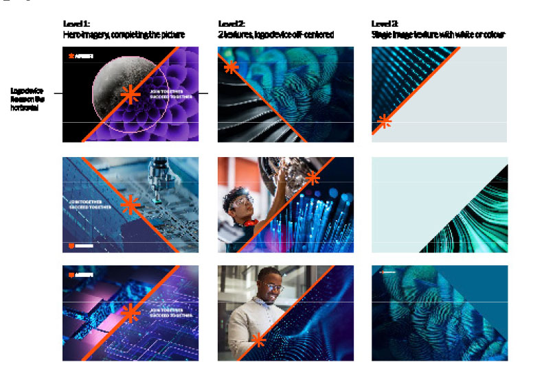
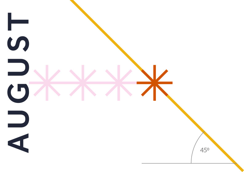
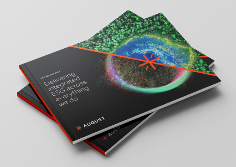
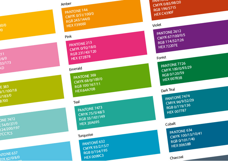
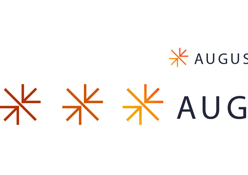

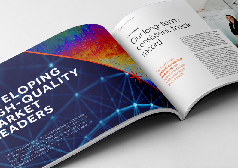
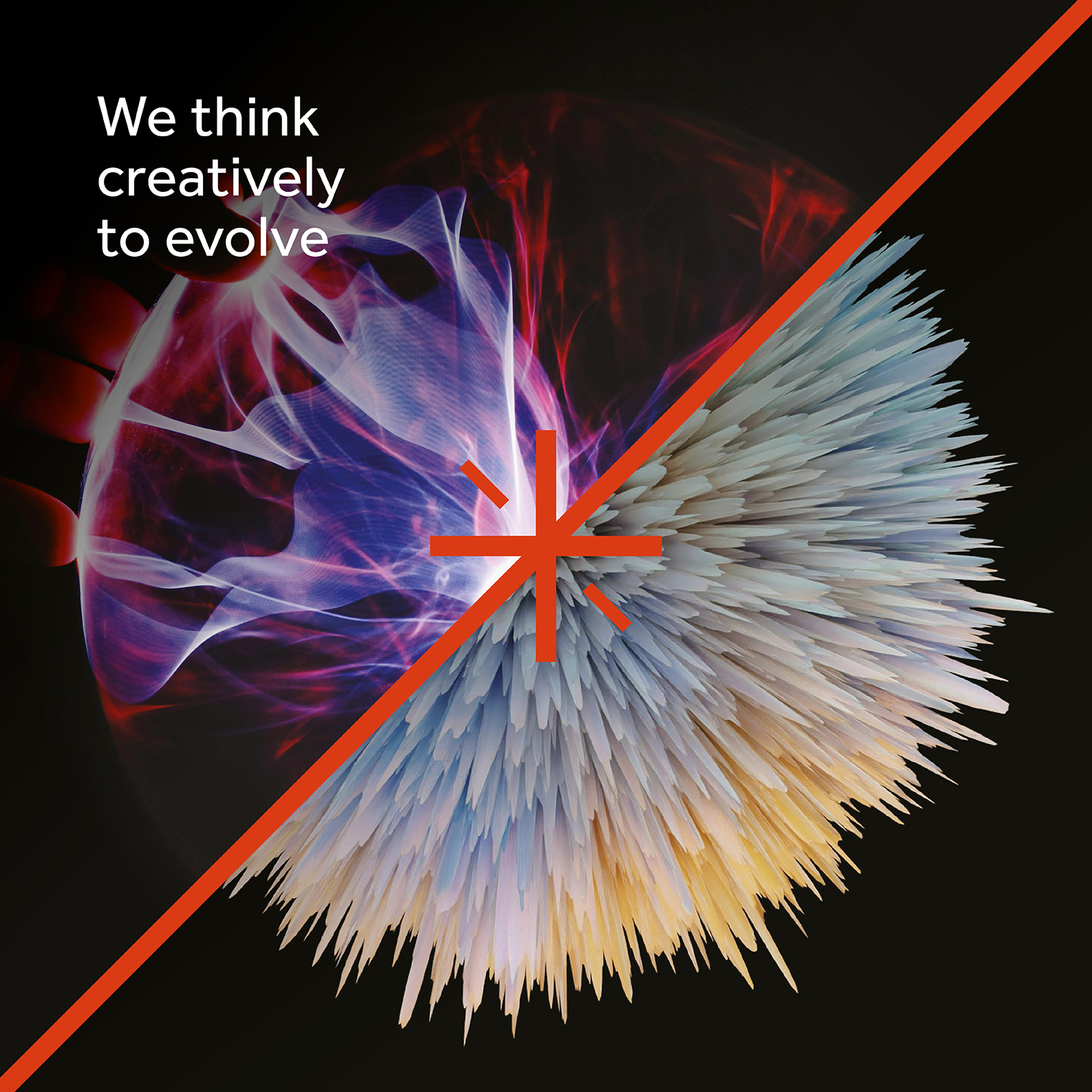
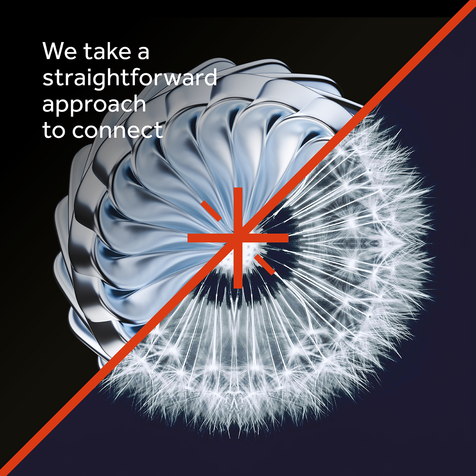
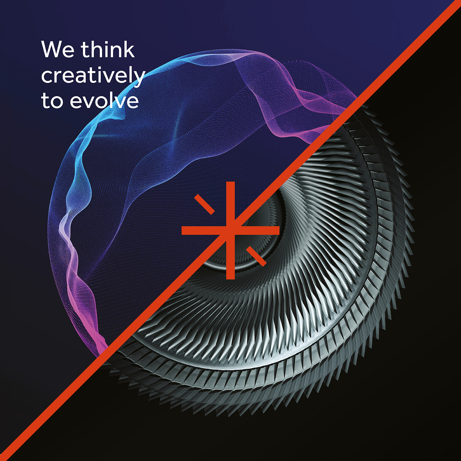
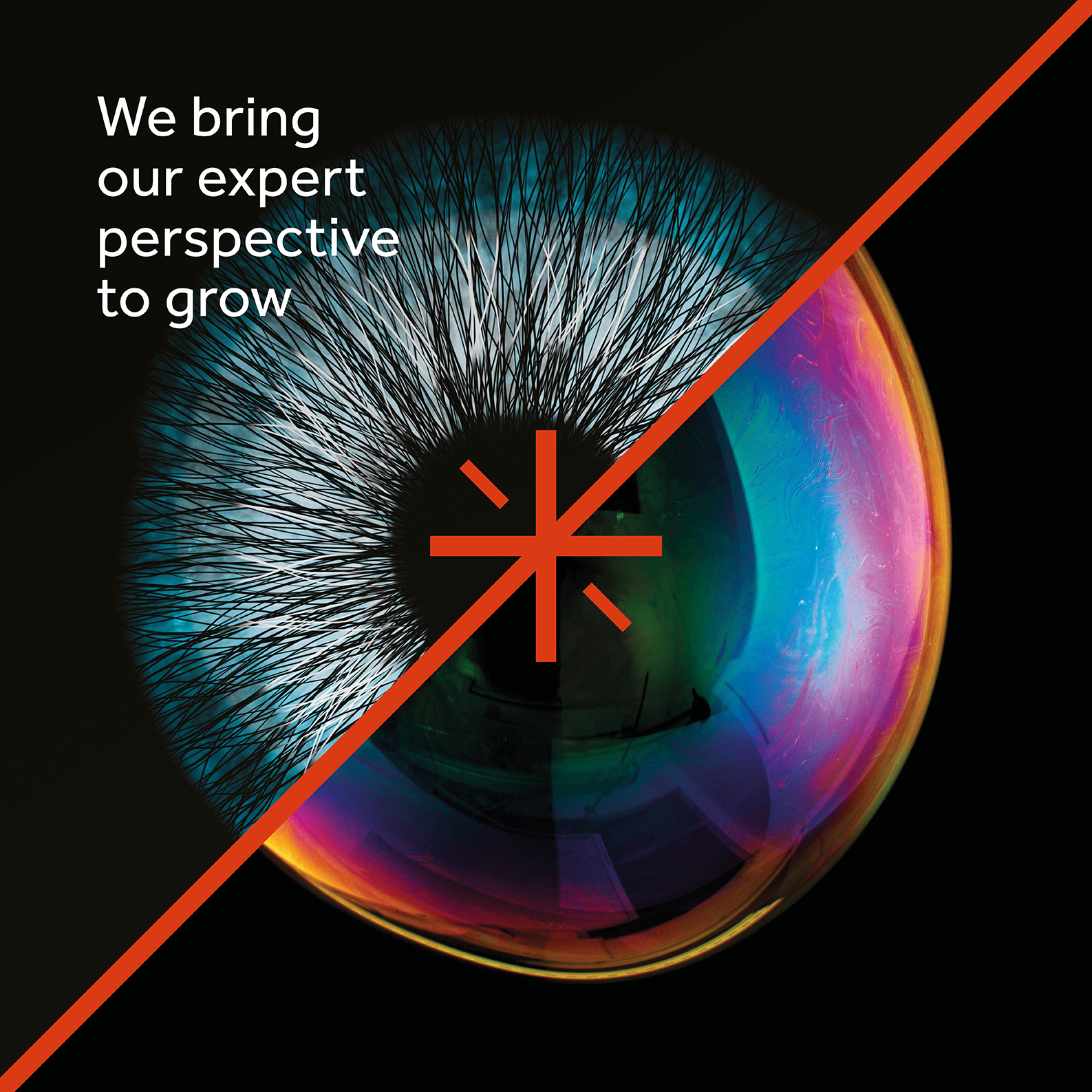
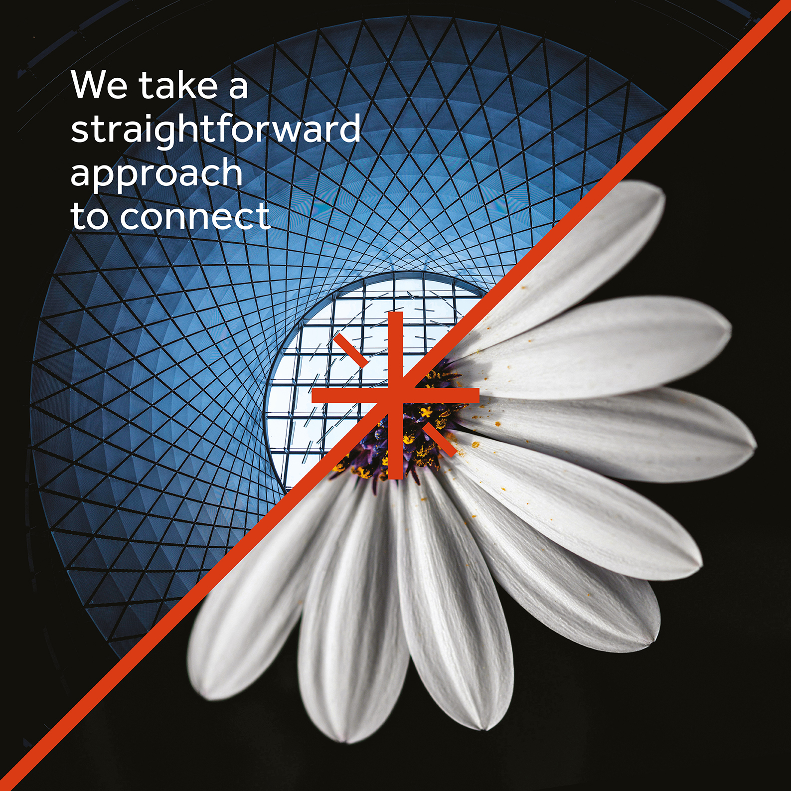
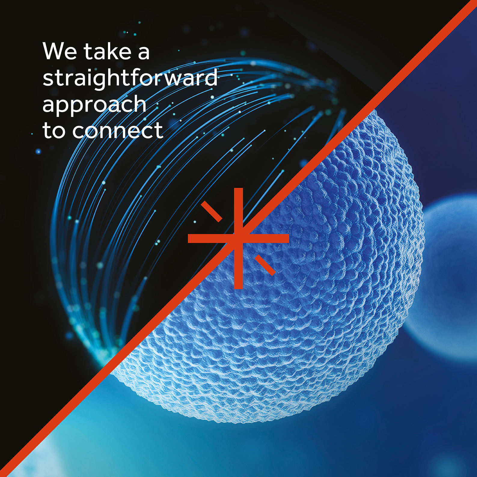
The refreshed identity reimagined August’s existing star symbol as an animated mark formed by two arrows joining together – a visual metaphor for the new company strap line of join together, succeed together. A confident new colour palette, distinctive typefaces and a curated library of abstract, aspirational imagery reinforced August’s position within the sector. We also developed a custom icon set, stationery suite, investor presentations, print templates, social media assets and launch materials.


A major brand touchpoint was the website – a complete reinvention of an outdated and underperforming platform. Built on a flexible CMS, the new site is accessible, fully responsive and rich in content. With concise messaging, bold visuals, and a video interview with Managing Partner David Lonsdale, it sets a new benchmark for how private equity firms present themselves online.
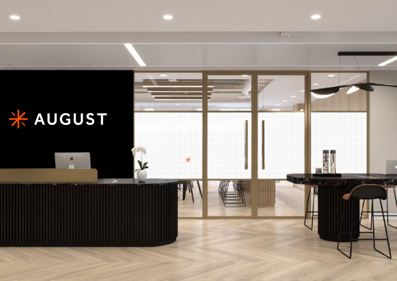
The timing of the rebrand was carefully aligned with August Equity’s move to its new offices in Covent Garden. We collaborated closely with the architects to ensure the physical space reflected the refreshed brand values, using the new visual identity to inform colours, shapes, textures, and signage throughout. The resulting environment not only reinforces August Equity’s position as a leading lower mid-market private equity firm but also creates an inspiring space for the firm’s future growth and ambition.